
 Book a Strategy Call

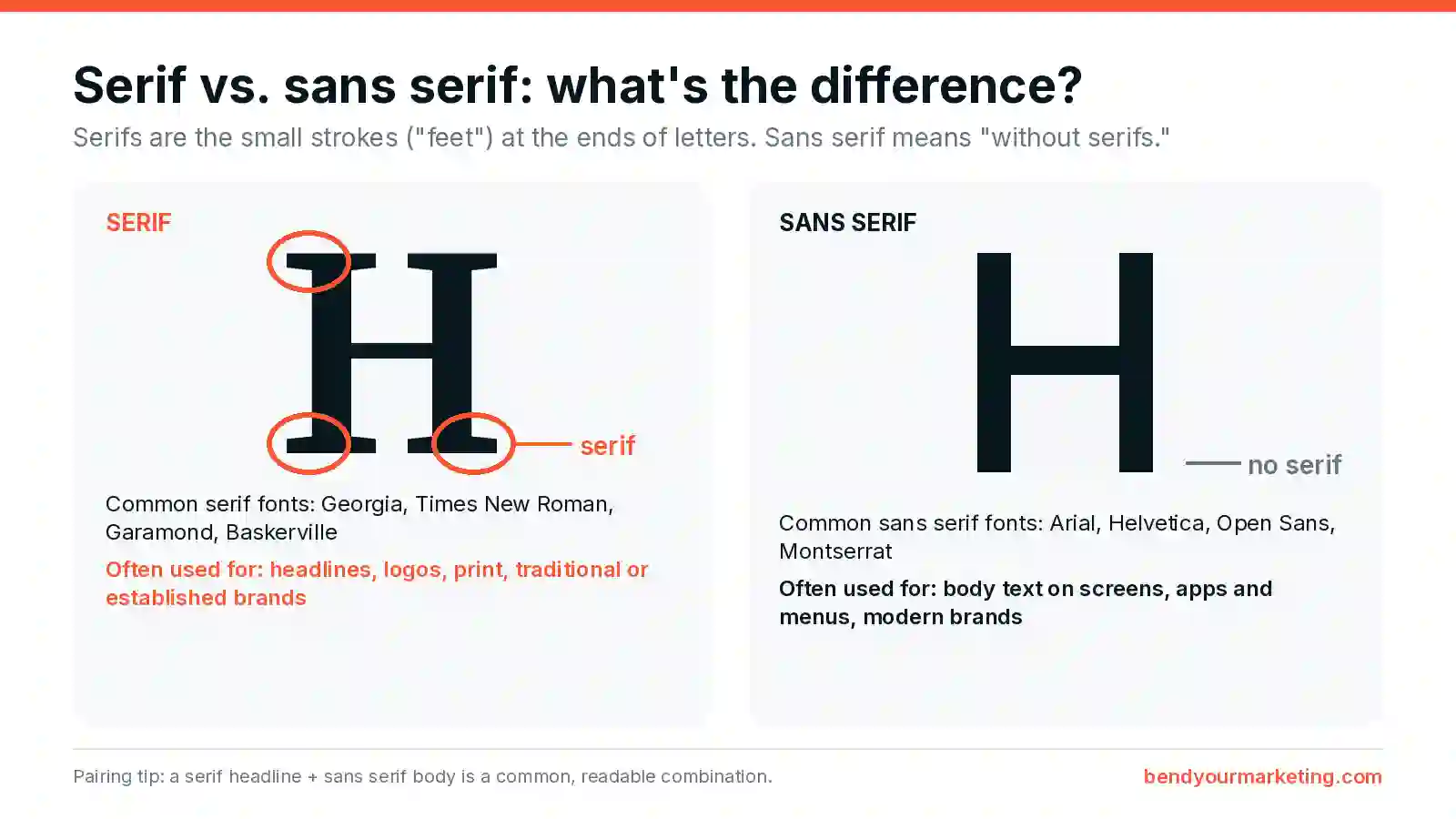
The short answer: Serif fonts have small strokes, called serifs, at the ends of letters (think Times New Roman or Georgia). Sans serif fonts don’t have them (think Arial or Helvetica). Serifs tend to feel traditional and established. Sans serifs tend to feel clean and modern, and they’re the usual choice for body text on screens. Many brands use both: a serif for headlines and a sans serif for everything else.
Deciding which type of font to use is like deciding how to decorate your home. You have a lot to consider, and how you want your space to make you and others feel is at the top of the list.
There are many aspects of your branding you have likely already decided on, but something else to give serious consideration to is choosing the right font for your brand and considering what it says to customers.
There are two main types of fonts or typefaces available: serif fonts and sans serif fonts.
Choosing the Right Font Is Important
Branding is about messaging and curating the right message to project to your customers. Decorating your home, as mentioned earlier, is similar. You decide how you want your space to feel – cozy or eclectic or traditional – and choose items based on that preference.
Choosing the right font is the same, but because branding is about what you want your customer to experience, you have an enormous opportunity to curate those emotions by being thoughtful about choosing the right font.
What Is the Difference Between Serif and Sans Serif Fonts?
The main difference between serif and sans serif fonts is the presence of small decorative strokes.
What Is a Serif Font?
A serif font includes small strokes, or “feet,” at the ends of letters. These decorative details add structure and formality.
Common serif fonts include:
-
Times New Roman
-
Georgia
-
Garamond
-
Baskerville
Serif fonts have historically been used in print media like books and newspapers.
What Is a Sans Serif Font?
A sans serif font does not include decorative strokes. The term “sans” literally means “without.”
Common sans serif fonts include:
-
Arial
-
Helvetica
-
Open Sans
-
Montserrat
Sans serif fonts have clean lines and a minimalist appearance, making them popular in digital environments.

—
3 Things You Can Do Right Now To Grow Your Online Traffic. Get Your Custom Assessment by Clicking Here!
—
What Does a Serif Font Say About Your Brand?
Because serif fonts have been traditionally used for print media, they provide a feeling of establishment and trustworthiness.
Serif fonts are the best choice for brands that want to instill a feeling of seriousness, loyalty, or classicalism.
Businesses providing things like law or medical services, car manufacturers, or even long-established family businesses may opt for serif fonts to further that feeling of experience and longevity.
Serif Fonts Examples in Web Design
The most commonly identified serif font today is Times New Roman, but serif typefaces themselves date all the way back to ancient Roman inscriptions and are still the predominant font for newspapers and books. Both Honda and J.P. Morgan use serif fonts in their logo designs.
Even though serif fonts are more popular in print material, they can still be an excellent choice for your brand and website design.


What Does a Sans Serif Font Say About Your Brand?
Sans serif fonts do have a less serious feel to them. Sans serif fonts provide a sense of modernity and approachability. They look very clean both in print and online and are easier on the eyes digitally than serif fonts.
Sans serif fonts are great for businesses that want their branding to project freshness, innovation, and simplicity. This type of font is often used by companies that provide entertainment and travel services, cosmetics, and something otherwise artistic and more casual.
Sans Serif Fonts Examples in Web Design
Sans serif fonts rose in popularity with the boom of the digital era, and they are easier to read through a screen. In fact, many web-based services like Hulu and Airbnb use sans serif fonts to attract their customers.
Like serif fonts, there are countless options for sans serif fonts, but the most easily identifiable one is Arial.


Serif vs. Sans Serif for Websites: Which Is Better for Web Design?
From a usability standpoint:
-
Sans serif fonts are generally easier to read on screens, especially at smaller sizes.
-
Serif fonts can still work beautifully for headings and branding elements.
-
Many modern websites use a combination of both.
A common strategy:
-
Serif for headlines (adds personality and authority)
-
Sans serif for body text (improves readability)
Easy serif + sans serif pairings to try
All of these are free on Google Fonts:
- Playfair Display + Source Sans 3: classic and elegant
- Merriweather + Open Sans: warm and very readable
- Lora + Montserrat: friendly and modern
Stick to two font families at most. Use one weight for headlines and one for body copy, and test both on a phone before you commit. Want to see pairings on real sites? Browse our Elementor website examples and Catholic website examples.
When choosing between serif vs. sans serif for web design, prioritize user experience first.
Tips for Choosing the Right Font for Your Brand
Consider the message you want to project.
The first thing to do when choosing the right font is to decide on the message you want to portray. Do you want your customers to feel protected and get a sense of loyalty or establishment? Or should they experience a deeper sense of approachability and simplicity?
Decide which type of font best fits your message.
If you’re an entertainment company or personal brand, you might lean toward the more casual sans serif font. If you’re creating a website or logo for a law firm, you will likely find that serif fonts provide the emotion you’re looking for. HubSpot recommends exploring the study of typography online to choose the best option for your brand.
Choosing a font for a logo? Your logo type should work at the size of a favicon and on a sign, so test it small and big. Our branding services can help.
Explore the serif or sans serif font options that suit your brand best.
After deciding which typeface works best for your brand message, explore all of your options for that type of font before choosing which one works best. There are so many options for each type of font, so take your time and compare the ones you like side by side.
FAQ: Serif vs. Sans Serif Fonts
Are serif fonts more professional?
Serif fonts are often perceived as more traditional and authoritative, but professionalism depends on brand context.
Are sans serif fonts better for websites?
Generally, yes. Sans serif fonts are easier to read on screens, especially for body text.
Can you combine serif and sans serif fonts?
Yes. Many modern brands successfully pair serif headlines with sans serif body text.
Which font type converts better?
There is no universal answer. Conversion depends on audience trust, readability, and alignment with brand positioning.
Serif vs. Sans Serif: Final Thoughts
Choosing between serif and sans serif can feel like one more decision on a long list. Getting it right gives your brand a consistent feel everywhere customers see you. At Bend Marketing, we’ve helped hundreds of clients with their branding and website design. Logo and brand identity projects run $2,000 to $3,500 (see our rate card). Not sure where to start? Request a free website and branding assessment. No strings attached.

